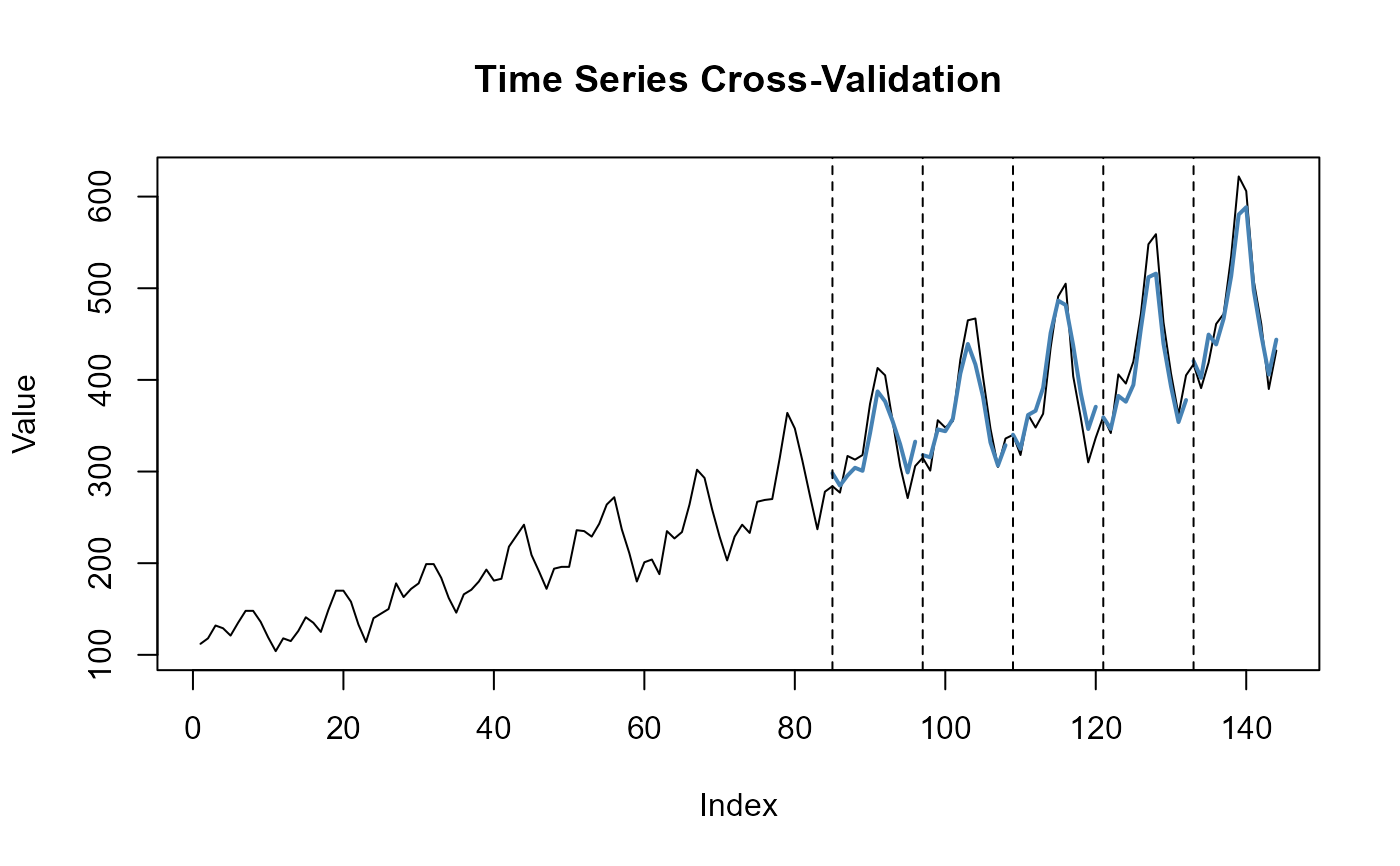
Plot actual values and the point forecasts from the best
hyperparameter combination selected via tune.esn() using the
selected accuracy metric. Forecasts are shown as separate line segments
for each test split, with vertical dashed lines marking the starts of test
windows.
Usage
# S3 method for class 'tune_esn'
plot(x, metric = "mse", ...)
Arguments
- x
An object of class
tune_esn. The result of a call totune_esn().- metric
Character value. The metric used to select the best hyperparameter combination (
metric = c("mse", "mae").- ...
Further arguments passed to
plot().
See also
Other base functions:
forecast_esn(),
is.esn(),
is.forecast_esn(),
is.tune_esn(),
plot.esn(),
plot.forecast_esn(),
print.esn(),
summary.esn(),
summary.tune_esn(),
train_esn(),
tune_esn()